Packaging that wins on the shelf
Crowded shelves do not forgive weak packaging. How we build multi-SKU packaging systems that read at arm's length, from Herban Bud to Hackboard.

On this page
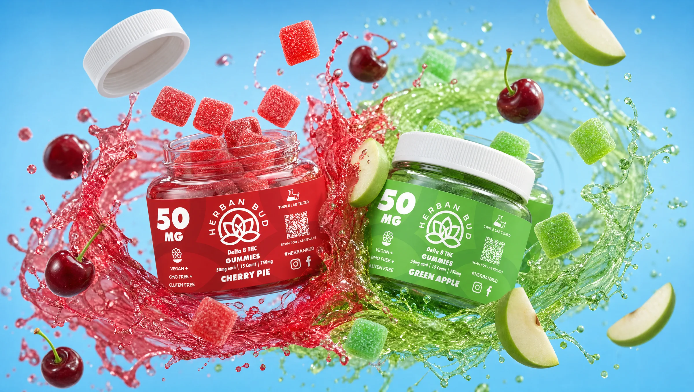
Herban Bud is a cannabis brand. We designed the packaging like that mattered, because it does.
In cannabis, the shelf is loud. Dozens of jars, pouches, and tins fighting for the same three seconds of attention. If your pack does not read from arm’s length, the sale is already gone. When Herban Bud came to us, the brief was clear: premium, playful, unmistakably Texas, and still crystal clear in a crowded category. Each product needed its own personality. The whole lineup still had to feel like one brand.
That is not a mood board problem. That is a packaging system problem.
One brand. Many products. No confusion.
The easy mistake is designing each SKU like a one-off. Flavor A gets a wild treatment. Flavor B gets a different vibe. By the fifth product, the shelf looks like five brands sharing a cooler.
For Herban Bud we built the opposite: a shared identity language first, then room for SKU-level character. Same bones. Controlled variables. From across the aisle you should know it is Herban Bud. Up close you should know which product you are holding.
That system is what makes a multi-SKU cannabis lineup feel elevated instead of scattered.
Design for the shelf, not the laptop
A pack that looks perfect on a screen can fall apart under store light. Hierarchy is the first place it fails. Brand name, product name, claims, and legal copy all screaming at the same volume turns into static.
We treat hierarchy like a sales tool. What does the shopper need to know in three seconds? Usually the product, then the brand, then the proof. Everything else earns its place after that.
Print a rough. Hold it at arm’s length. Put it next to the competitors you actually compete with. If you cannot read the product and the promise fast, you are not ready to print.
Personality without losing the family
Herban Bud needed playfulness without looking cheap, and Texas roots without costume. That balance lives in the details: color, type, label structure, and how much character each SKU is allowed to carry.
The goal was not “make it cool.” The goal was make it recognizable, ownable, and consistent when the lineup grows. Packaging systems that only work for two SKUs break the moment the brand expands. Build for the family you have and the family you are about to have.
Same rules, different category: Hackboard
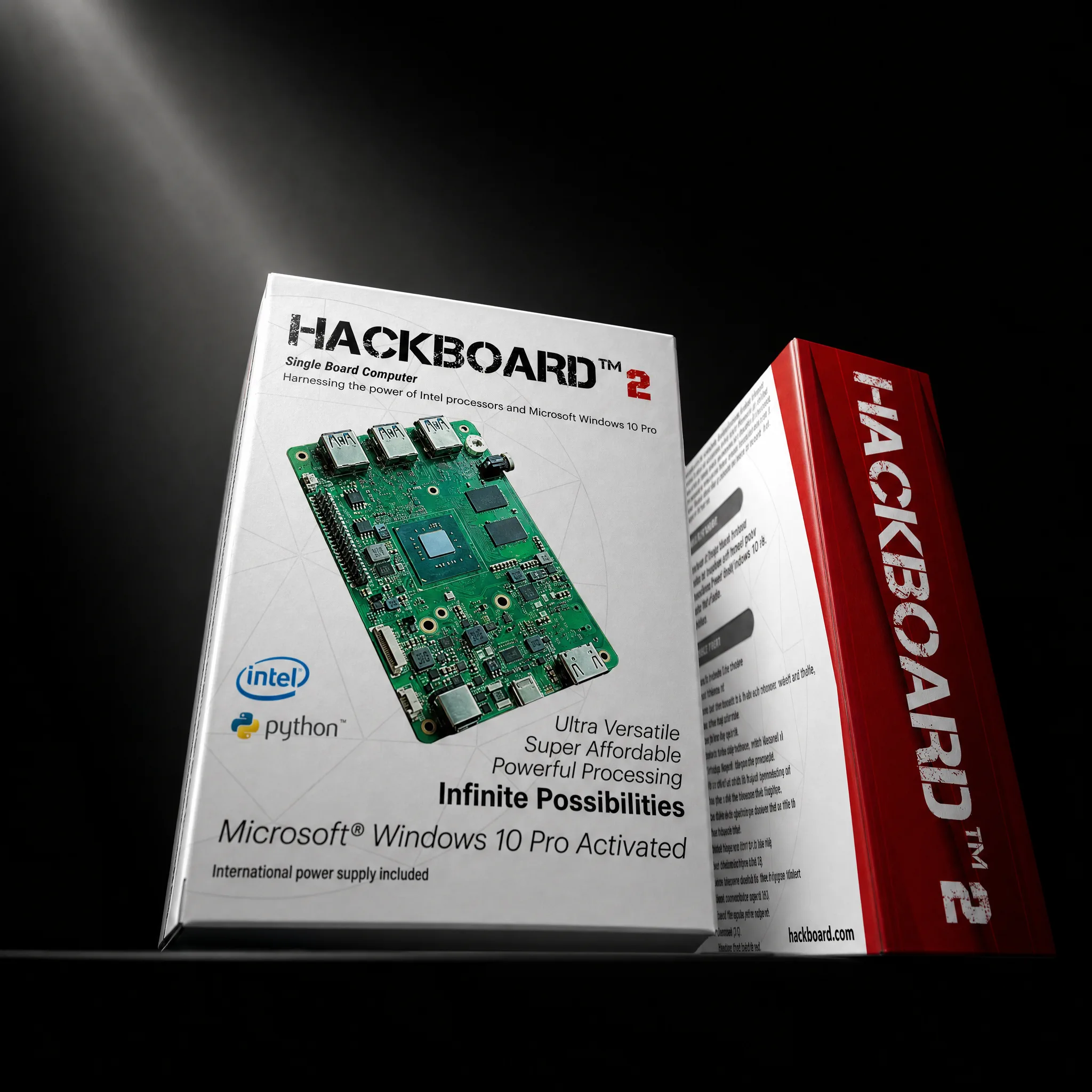
Hackboard was a different beast. Global product launch. Principals in Austin, London, and Shenzhen. Website, packaging, assets, shipping systems, and pre-order hype, all moving at once.
Different category. Same packaging truth: the product has to feel intentional the second someone sees it, whether that is on a shelf, in a social feed, or in a box that just hit their door. Packaging is not a side deliverable on a launch. It is part of how the brand shows up under pressure.
What we take into every packaging job
- System before decoration. Shared structure first. Personality second.
- Hierarchy that sells. Three-second clarity beats clever lockups.
- Real-world tests. Screen is not shelf. Print and compare.
- Claims that hold up. Specific beats vague every time.
- Room to grow. If the fifth SKU breaks the system, the system was never finished.
Herban Bud still screams this for us. A cannabis brand that has to win in a noisy category cannot hide behind a pretty logo. The packaging has to do the work.
If you are building a product brand that has to earn the pick-up, start with strategy, then design the system. That order is the whole game.
See the Herban Bud work · Austin packaging design · Solutions · Start a project
Let's build yours.
Tell us what you are working on. A real person reads every message.