A brand book is how a brand keeps its word
A brand book keeps every menu, page, and print piece on brand. What brand guidelines should cover, and the brand guide we built for Gina's on Congress.


On this page
Almost every business I start working with has a drawer somewhere with three versions of its logo in it. One stretched to fit a banner, one in a red nobody picked, one a friend made the week before opening. Nobody plans that drawer. It fills up on its own when a brand has no book.
A brand book is the document that holds your brand guidelines in one place: how the logo is drawn and where it sits, which colors and typefaces belong to you, how you sound, and how all of it shows up on real things. It is not a coffee table book. It is the manual for your brand.
A brand book is the rulebook your team actually opens
The terms overlap, so here is how I separate them. Brand guidelines are the rules themselves. A brand book is the finished document that holds those rules, usually with the story and the reasoning up front. A brand style guide leans harder on the details: color codes, type sizes, spacing, grammar preferences. Brand standards is the phrase you hear in bigger companies with franchise manuals and approval forms.
So if someone asks you what a brand book is, or what a brand guide is, the honest answer is that they are close cousins doing the same job. What makes one useful is simple. A manager, a printer, or a new hire can open it and get a straight answer in under a minute.
The brand book usually comes last in brand identity design, and it decides whether the rest of the work survives the first year.
Every brand book starts with a brief
Before anyone draws a letter, someone has to write down what the brand is for. Who walks in. What they should feel at the door. What the place refuses to be. That is the brief, and it sits at the front of every brand book we build, because every rule after it has to trace back to something there.
A color rule with no reason behind it gets broken the first time someone likes a different color better. A color rule that says this tone carries the warmth of the room has something to defend it. The name belongs in that brief too, which is why I keep saying naming is brand strategy and not a box to check after the design is done.
Brand guidelines cover more than the logo
The logo gets the attention, but it is one section of many. A complete set of brand guidelines covers:
- Logo and wordmark. Every approved version, clear space, minimum size, how it sits on light and dark, and what never to do with it.
- Color. Values for print and for screen, plus which color leads and which ones support.
- Type. The faces you use, where each one goes, and how big a headline gets before it starts shouting.
- Voice. How the brand talks, a few words it uses, and a few it avoids.
- Photography. Light, mood, and subject, so every image feels like the same place.
- Application. The brand on actual things, in actual sizes.
That last section is where most guides get thin, and it is where most mistakes happen. For restaurant branding in Austin, application is most of the work, because a restaurant touches guests in more physical places than almost any other business.
Gina’s on Congress: a brand guide built on Paris and Rome
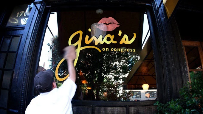
Gina’s on Congress was a restaurant on historic Congress Avenue, steps from the Texas Capitol, with a menu that drew from both Paris and Rome. The brief asked for something timeless without leaning on nostalgia. An old building and an old-world menu can slide into costume fast, and we did not want a theme. We wanted a brand that felt like it had always been on that block.
We built the identity around a hand-lettered wordmark instead of a typeface, so the name read like it had been signed rather than set. Underneath it sat a muted ochre palette. Then we wrote it all down in a brand guide, so the work would hold after we handed it off.
The guide moved the way a guest would. Personality first, then the identity itself: the custom lettering, the supporting type, the colors with their print and screen values. Then it showed the system at work, on window lettering for the storefront, on cocktail napkins at the bar, and on business cards for the team. Each piece used the same mark with the same restraint, so a napkin and a front window felt like they came from the same hand.
The engagement reached past the guide. We built the investor pitch deck, did the custom lettering, and handled menu creation and management. The guide was what tied those pieces together and kept them speaking one language. You can see more of that thinking across our work.
Want to see the whole thing? Download the full Gina’s on Congress brand guide (PDF, 1.1 MB). It is the real document, all 18 pages, with contact details removed.
The guide has to reach the menu, the web, and the print run
A brand book proves itself at handoff. The printer gets a color value instead of a guess. The web developer gets the type and the spacing instead of a screenshot. The person updating the menu on a slow afternoon gets a layout to work inside, not a blank page.
For Gina’s, one system carried across the mark, the web, and print. Because we handled the menus too, the guide and the menu came out of the same decisions. Nothing had to be translated from one designer’s taste to another’s. I wrote more about that side of things in restaurant menu design.
Print is where a brand drifts first. Paper changes how a color reads. Ink spreads on uncoated stock. A rich tone on screen can go flat on a small square of paper. A good guide plans for that and says what to do: which version of the mark to use at small sizes, which color to lean on when a job only allows one, and how much room the lettering needs around it.
The best brand book examples are the ones in daily use
Search for brand book examples or brand guidelines examples and you will find gorgeous decks from global companies. They are worth studying. Most were also built for teams of hundreds, and a restaurant or a small product brand does not need two hundred pages.
What separates a guide people use from a PDF nobody opens:
- It is short enough to read in one sitting.
- It shows real applications, not just the logo floating on white.
- It says no clearly. One page of misuse examples saves a lot of reprints.
- It lives where people work, shared with the printer, the sign shop, and whoever runs social.
- Someone owns it and updates it when the business changes.
Size the book to the business. For food truck branding, the brand book might be four pages and a folder of files, and that is plenty if the crew can find it on a Saturday morning.
Start with the brief, not the logo
Most owners come to us wanting the logo first. It is the visible part, so I understand it. But a logo drawn before the brief gets defended on taste alone, and taste loses arguments. Start with what the brand has to say and who it has to say it to. The logo, the palette, and the brand book all follow from that, and they stay consistent because they share a reason.
If you are opening a place, growing past your first location, or just tired of that drawer full of logos, I would love to help you put it all in one book.
Let's build yours.
Tell us what you are working on. A real person reads every message.