Herban Bud
Crafted for a modern cannabis brand.
The challenge
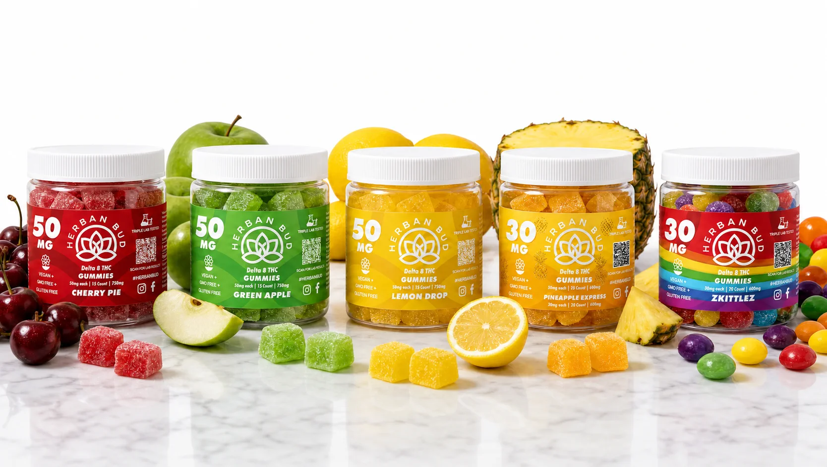
Herban Bud needed a look that felt premium, playful, and unmistakably rooted in Texas without losing clarity at the shelf. In a crowded cannabis category, each product had to read as its own personality while still belonging to one cohesive brand family.
What we did
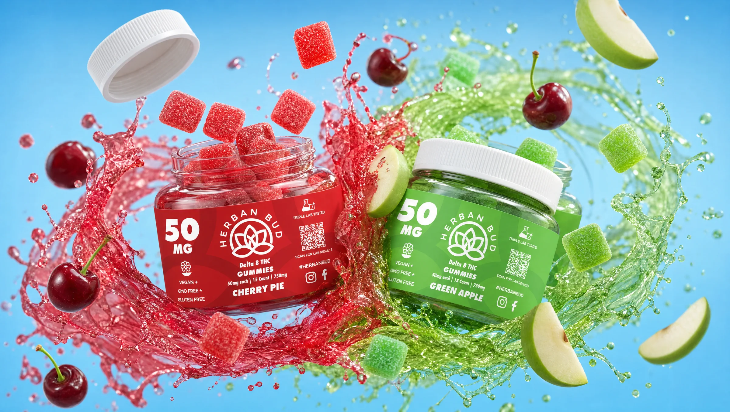
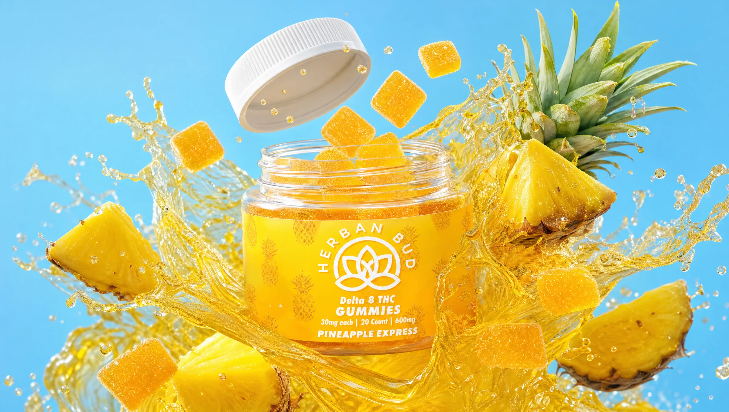
We built a bold visual system across packaging and label design: a shared identity language with room for SKU-level character. The system holds the lineup together so the brand feels elevated and instantly recognizable from arm's length and up close.
Services
Brand identity, packaging, label design, and creative direction for a multi-SKU cannabis product family.
Outcome
The brand feels elevated, memorable, and instantly recognizable. Every detail carries the energy the team wanted from day one.
Build yours
Building a product brand that has to win on the shelf? See Solutions and Contact, or read Packaging that wins on the shelf. Related: City Jewell, Medley Food Co..

The brand feels elevated, memorable, and instantly recognizable. Every detail carries the energy we wanted from day one.